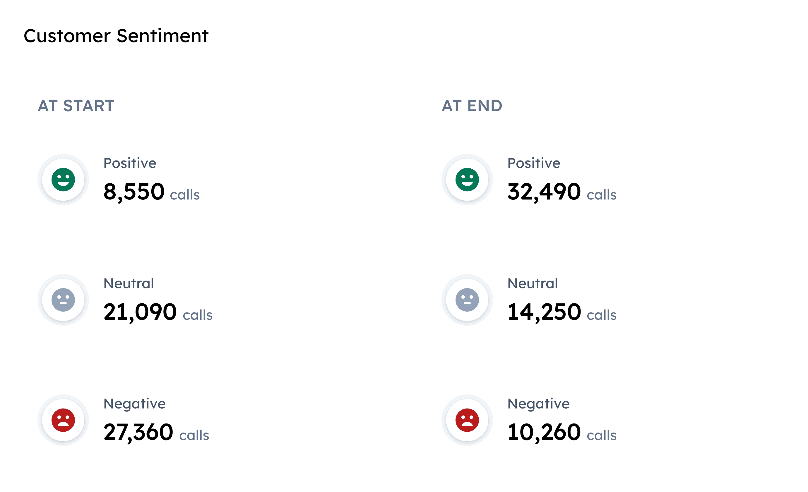
Conversation Insights
My story leading an enterprise data analytics product design project for RozieAI that improved operational efficiency and helped secure renewed contract with clients.

Role
Product Design, Prototyping, User Flows, UX Strategy
Team
1 Product owner, 4 Engineers, Designer (me)
Client
One of the leading Airline Carriers in North America
Impact
Drove adoption across 3 internal teams and reinforcing client trust that proved key to contract renewal (revenue growth).
Context:
A High-Stakes Project
Business
RozieAI is a B2B startup operating in the Customer Experience (CX) space which focuses on building AI-powered CX solutions like contact center software. The company served enterprise clients primarily in the airline and insurance sectors.
Product
Conversation Insights is an AI-powered analytics platform for contact centre teams to help them deeply understand their customer conversations by surfacing key insights from large volumes (data) of customer interactions.
Client
This product initially served one of North America's leading airline carriers and later was adopted by 3 other clients.
Opportunity
With a major client contract renewal approaching with the airline client, we had a clear incentive to rethink how insights were delivered. The initial manual and service-heavy model limited scale and tied value to internal effort.
By turning this into a self-serve product, we could shift insight discovery directly into clients’ workflows—reducing internal overhead while increasing the product’s long-term value and repeatability across customers.
Problem:
A Manual Process That Couldn't Scale
Before we built this product, our process for delivering conversation insights to the client was completely manual and wasn't just scalable. It caused:
Internal Inefficiency
Product Owners served as intermediaries between data scientists and clients.
Insights were translated into Excel reports and slide decks.
This dependency slowed delivery and created interpretation gaps.
Product Owners were pulled away from higher-leverage work.
Critical client bottleneck
Clients couldn’t independently explore or validate insights.
Every new question (e.g., “Why did this spike happen?” or “Which calls drove this insight?”) required a separate request.
Insights became reactive rather than actionable.
Time-sensitive weekly stakeholder reviews were especially impacted.
Every week felt like we were reinventing the wheel just to deliver the same kind of insights.
RozieAI Stakeholders
We were spending more time collecting and formatting data than actually solving problems.
RozieAI Stakeholders
We couldn’t afford to wait days for insights when our operations team needed answers by the next morning.
Client Team
At its core, the problem wasn’t generating insights. It was making them accessible and explorable at scale.
Challenge:
Balancing High-Level Signals with Deep Investigations
I worked closely with Product Owners and Data Scientist to understand what insights were being manually packaged and how different stakeholders used them. I did this to understand how interpretation and decision-making varied by role.
The core challenge was that these two personas needed the same data, but at fundamentally different levels of abstraction.
Leadership
Higher-level stakeholders who are responsible for overall contact centre performance.
Need a fast understanding of what changed, without navigating call details.
Quality Optimization Teams (POs and Analysts)
Power users whose job is to identify root causes, spot trends, and find specific coaching opportunities.
Need to trace high-level trends back to individual calls to investigate the specifics like root causes, intents, etc.
So, how might we design a product that feels intuitive enough for a 10-second scan, yet robust enough for a 10-minute investigation?
Before Diving into Solution Highlights…
What Did I Do?
Stakeholder Collaboration
I facilitated discovery workshops with customer teams to understand core pain points, decision-making gaps, and the metrics that meaningfully impact their workflows.
I partnered closely with a data scientist to unpack the AI models’ insight taxonomy, translating complex model outputs into usable information architectures.
I collaborated with product owners to define user stories, align on product requirements, and shape experiences grounded in user needs and business goals.
UI Design, Prototyping, & Design Developer Hand-off
I designed high-fidelity interfaces in Figma, crafting detailed mocks and interactive prototypes that simulated data states, edge cases, and user workflows. These prototypes were used to align stakeholders, validate interaction patterns, and de-risk engineering implementation before development.
I established a component system, defining reusable UI patterns, spacing rules, and data-visualization standards. This resulted in visual consistency across the product while enabling faster iteration and smoother collaboration with engineering.
Solution Highlights:
Elaborating my Design Decisions
Overview & Table View
Overview: Top View
Overview: Bottom View
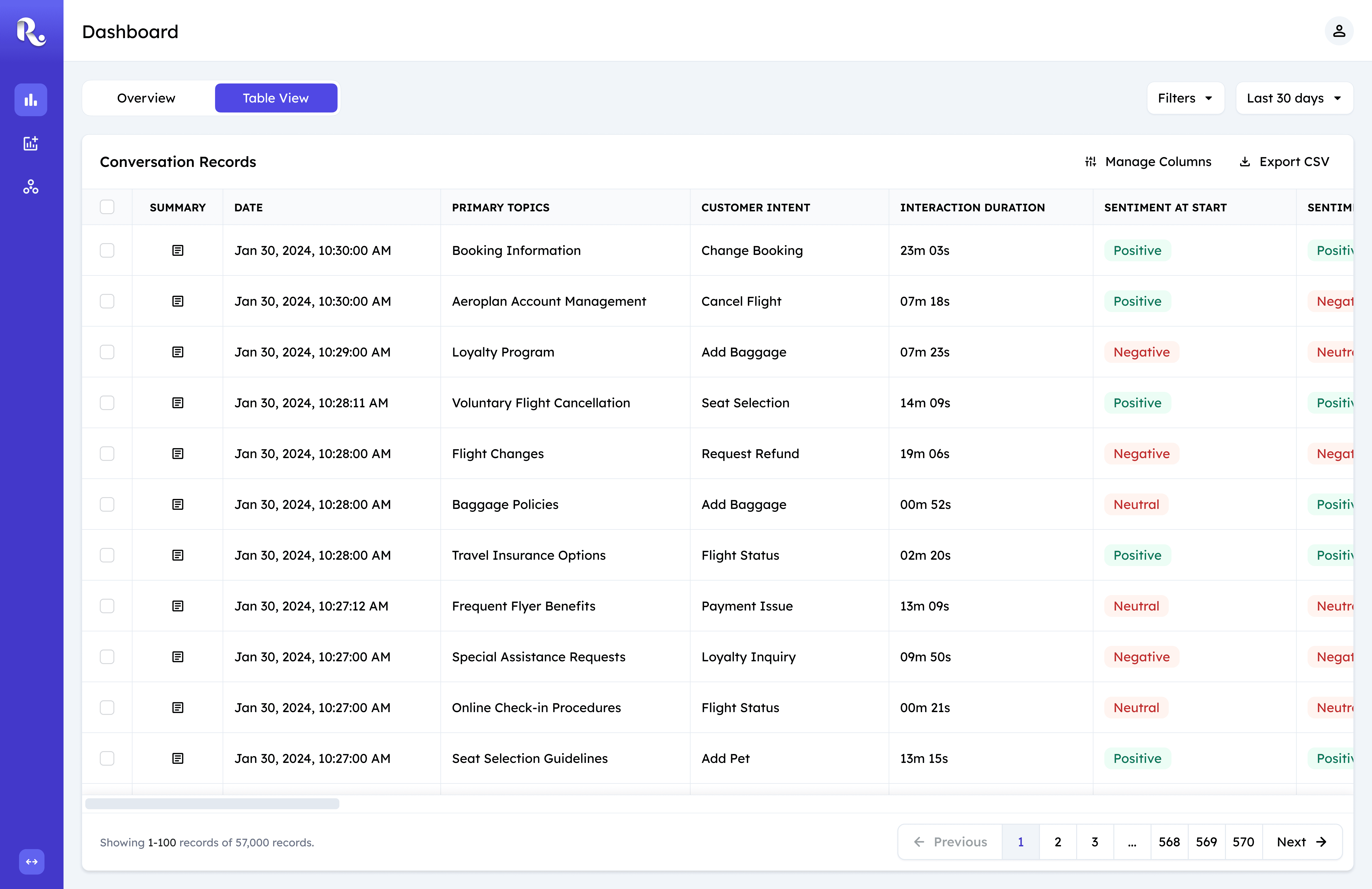
Table View
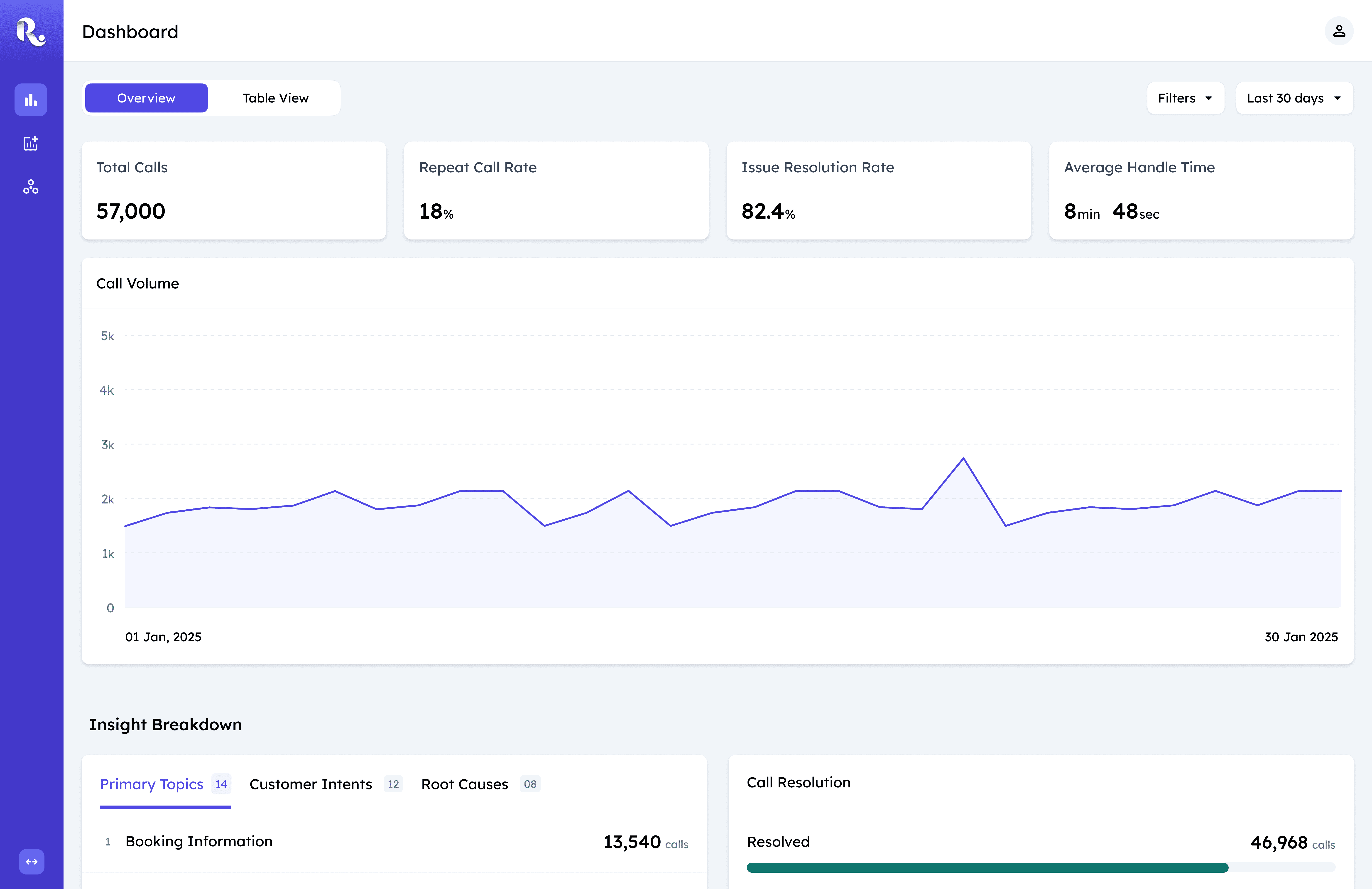
To address the distinctive user needs, I designed a single-page dashboard with two complementary views: Overview and Table View.
Overview is the default entry point, optimized for rapid comprehension. It surfaces key insights through scannable summaries that allow users to quickly understand what’s happening at a glance.
Table View supports deeper investigation, enabling analysis of individual call records across 60+ attributes. It’s designed for precision - where detailed analysis is required.
The tabbed structure intentionally separates monitoring from investigation, allowing users to move between speed and depth without changing context or navigation.
Overview Cards
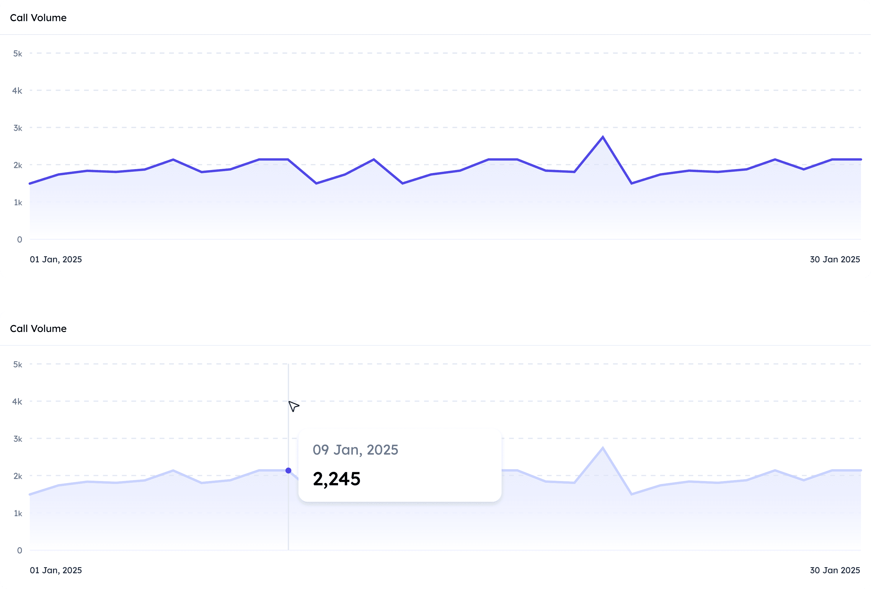
Call Volume
Overview: Design Principle
All components in the overview are guided by a single principle: clarity at a glance. These dashboards are used in fast-paced operational contexts, so the design prioritizes immediate comprehension over density. Every visual decision is optimized to help users absorb key signals in seconds, not minutes.
Call Volume Over Time
Understanding call volume patterns was one of the strongest asks from client teams, particularly to identify spikes within specific time periods. A line graph was the natural choice—it’s the most intuitive way to communicate change over time.
The default state presents a clean, high-level overview, while hover interactions reveal precise values on demand. To avoid unnecessary visual noise, the x-axis only displays the start and end dates, keeping attention on the overall trend rather than individual ticks. This balance allows users to quickly assess patterns while still accessing detail when needed.
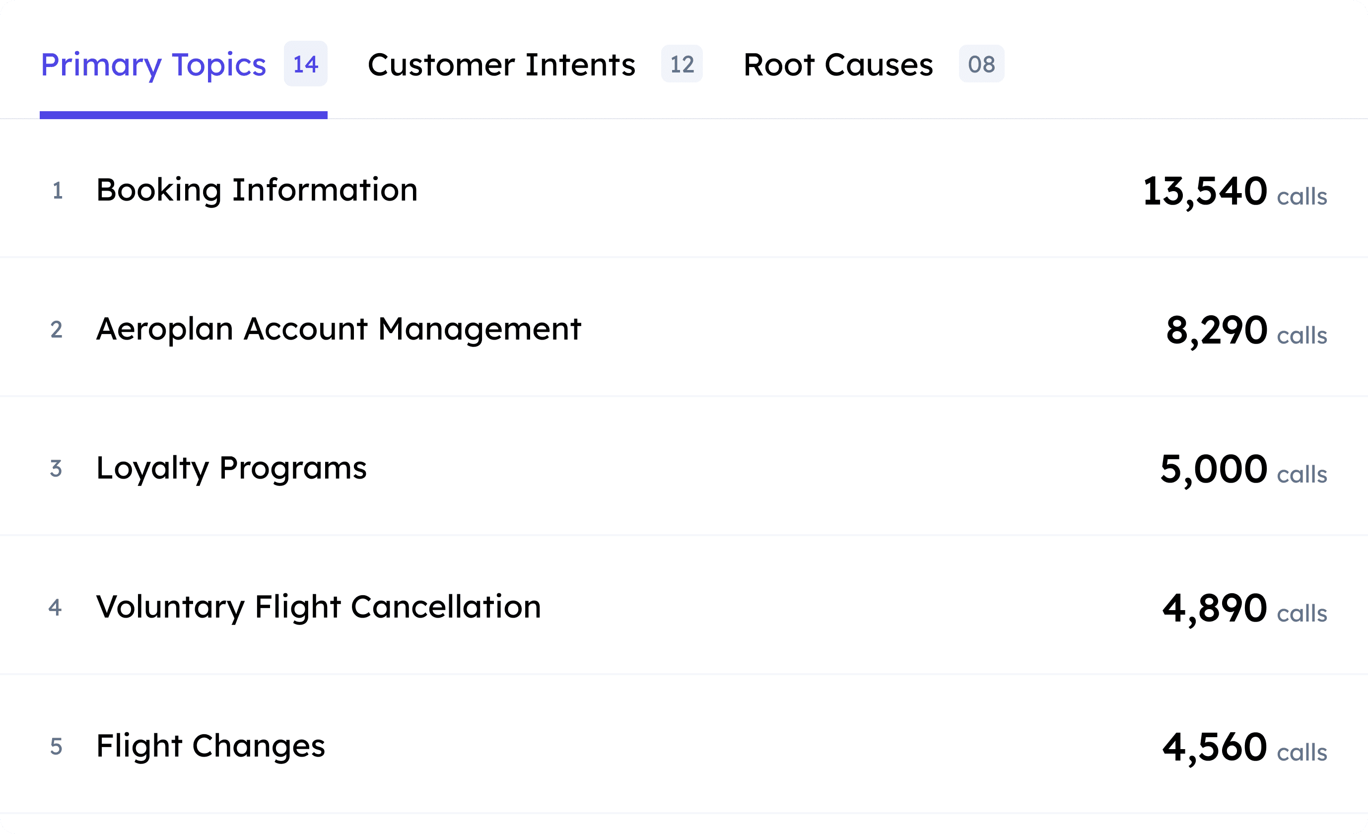
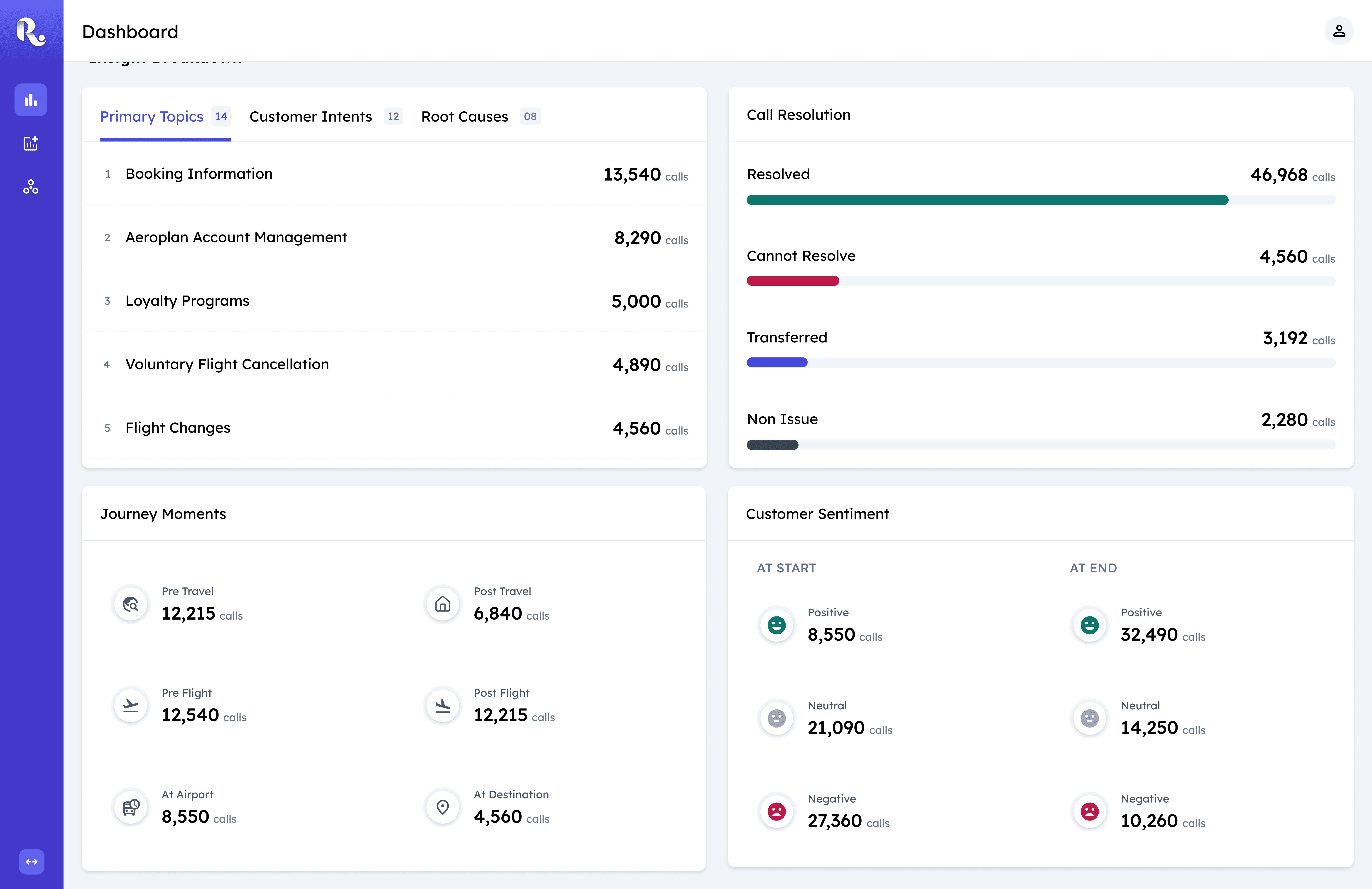
Primary Topics, Customer Intents, Root Causes
Topics, Intents, and Root Causes
Primary Topics, Customer Intents, and Root Causes are grouped into a single tabbed component because they represent closely related dimensions of why customers are calling. Since all three share a common data structure—label and call count—this approach creates consistency and reduces mental context-switching.
Within each list item, the label and count carry equal importance. A two-column layout gives both elements equal visual weight and creates two clear scannable paths: one for understanding what the issues are, and one for quickly comparing how frequently they occur.
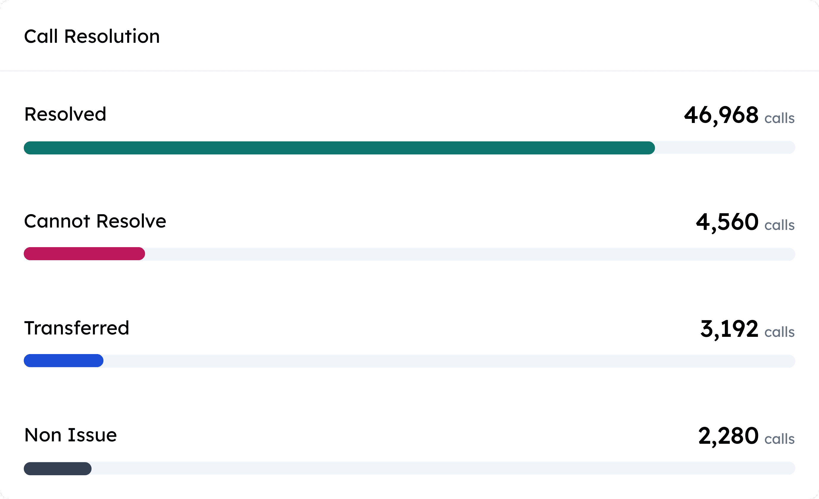
Call Resolution
Call Resolution
The Call Resolution component provides a fast, visual summary of call outcomes. While it maintains the same two-column structure as other list-based components for consistency, each category is paired with a horizontal bar.
The bar length acts as an immediate visual cue, enabling users to compare outcomes far more quickly than reading numbers alone. This makes dominant patterns instantly visible and helps teams identify outliers or imbalances at a glance.
Call Resolution
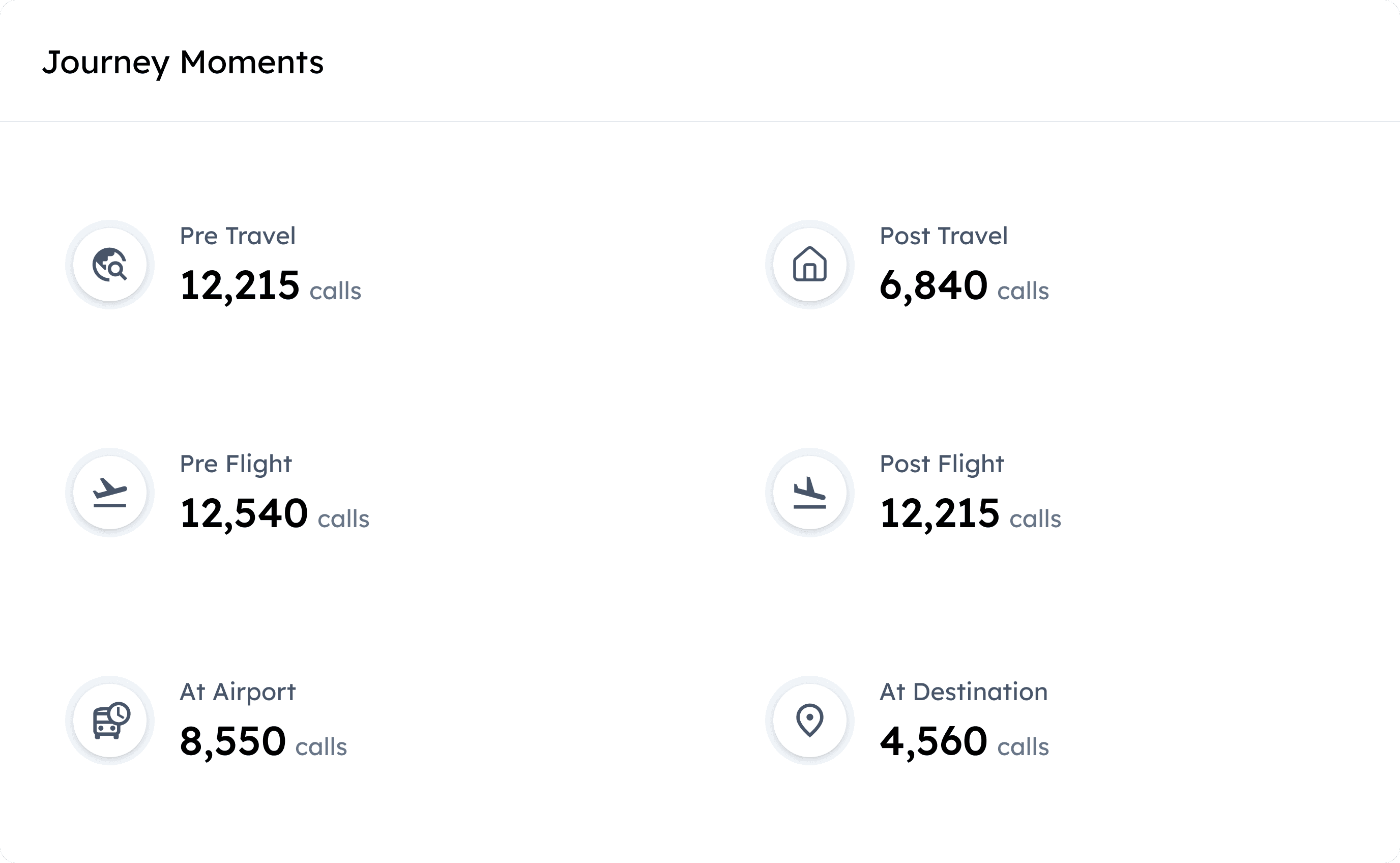
Journey Moments
Customer Journey Moments
This component adds critical context around when calls occur within the customer journey. A two-column grid layout makes the information easy to parse, while pairing related but opposing stages—such as Pre-Flight and Post-Flight—on the same row enables quick comparison and highlights asymmetries across the journey.
Distinct icons reinforce each journey moment, improving recognition and reducing reliance on text alone. These visual signifiers help users orient themselves quickly and scan the component with minimal cognitive effort.
Data Filtering Experience

User views table view
One of the core challenges was designing a filtering system that could handle over 60 attributes without overwhelming users, while still allowing the team to ship quickly.
To ground this decision, I ran a rapid competitive benchmark of data-intensive tools and saw the following two common patterns emerge.
Always-visible column filters:
Filters are constantly visible, increasing visual density even when not in use.
Header rows become crowded, reducing scannability of the data itself.
The interface prioritizes control over focus, especially on wide tables.
Works well for known & repetitive workflows.
Becomes difficult to manage as column count grows or filters stack.
Query builder filters:
Hidden by default, preserving visual focus on the data.
Complexity is revealed progressively, only when users opt in.
Supports complex, multi-condition queries across attributes.
Scales well as data complexity increases.
Encourages deliberate filtering rather than trial-and-error clicks.
I evaluated both patterns by closely examining their UX, scalability, and implementation cost. While column filters offered speed, they quickly broke down at scale.
I chose a query builder because it aligned with existing user mental models, handled complex filtering needs more effectively, and scaled without introducing ongoing engineering dependency for incremental changes.
Impact:
The Real Deal :)
Adoption
Adopted by 4 contact centre teams within the client organisation; demonstrated to 3 external clients, all of whom expressed interest in rollout.
Efficiency gain
100% elimination of manual insight delivery which enabled contact center teams to access insights faster.
Qualitative validation
Broader adoption across departments and strong stakeholder feedback reinforced the product’s value as an indispensable daily tool for clients.
Business outcome tie-in
Success led to requests for new feature support requests (under NDA) and secured a renewed client contract which validated the product’s long-term business impact.
Thanks for Reading!
Thanks for following along! While I've walked you through the key strategic decisions, there's a lot more to the story.
I'd love to chat more about the detailed design iterations and the process of balancing business goals and engineering constraints. If you're interested in hearing more, I'm always up for a conversation!