Back

Conversation Insights

Eliminating manual insight reporting in contact centers with self-serve analytics platform to enable faster operational decision making.

Company
RozieAI Labs
Client
Air Canada
Timeline
Q3 2024 - Q2 2025
Role
Product Designer

Analytics Platform for Air Canada's Contact Centre Managers

Conversation Insights is an analytics platform developed by RozieAI for Air Canada's contact centre managers (users). The platform uses AI to analyze hundreds of thousands of customer calls, surfacing trends and operational signals that help managers understand their customer issues at scale. Although initially built to meet Air Canada's operational needs, the product was designed as a scalable solution for future enterprise customers.

Air Canada contact centre managers had access to AI-generated insights, but not a way to investigate them independently

Before Conversation Insights, AI-generated call insights were delivered as weekly reports prepared by RozieAI product owners. While these reports helped Air Canada teams identify emerging issues, they provided limited context for understanding where those issues were occurring or what was driving them.

Investigating an issue was a big hurdle because it required moving between reports, AWS Connect, and follow-up discussions with RozieAI stakeholders to piece together the operational context. Users therefore depended on a fragmented, people-dependent workflow to move from identifying an issue to understanding it, slowing how quickly they could make operational decisions.

Understanding the system - users, data, & how teams analyzed customer issues.

I first aligned with RozieAI product owners, data scientists, and Air Canada stakeholders to understand how teams used insights to investigate customer issues. I found that reports helped managers identify issues, but understanding what was happening and where required piecing together information from multiple sources. So I focused the product on supporting that investigation rather than recreating the reports.

Who are the users?

Users are Air Canada's contact centre managers who used insights to identify emerging customer issues, then traced those issues to specific calls and operational patterns to understand where they were occurring.

What data do they use?

By surfacing with data scientists, I found that teams combined two complementary types of data (RozieAI generated insights and AWS Connect attributes):

RozieAI InsightsAWS Attributes
Primary TopicsInteraction Duration
Customer IntentsRouting Profile
Root CausesAgent Username
Sentiment AnalysisQueue Name
Journey Moments60+ Attributes
How did teams analyze issues?

In order to understand how users approached analyzing customer issues, I conducted 6 interviews with team members. I found that insights were rarely consumed in isolation. Instead, they served as starting points for a broader analysis into their operational metadata.

The teams consistently followed this investigation workflow:

  1. Scope

    Define a time window to frame the analysis.

  2. Identify Issues

    Detect unusual patterns and emerging customer concerns.

  3. Understand Causes

    Use summaries and transcripts to understand what customers are experiencing.

  4. Trace Operational Impact

    Identify where the issue is occurring using call records and operational data.

Insights

The investigation workflow revealed that insights were not endpoints, but starting points for understanding and resolving customer issues.

Teams used call insights to identify issues, then combined it with operational metadata to understand causes, trace impact, and take action.

Initial Product Hypothesis

I used the investigation workflow I uncovered in discovery to structure the first version of the product. Teams moved through four stages: Scope, Identify, Understand, and Trace. I designed the experience around that sequence, rather than treating the dashboard as a collection of charts and data.
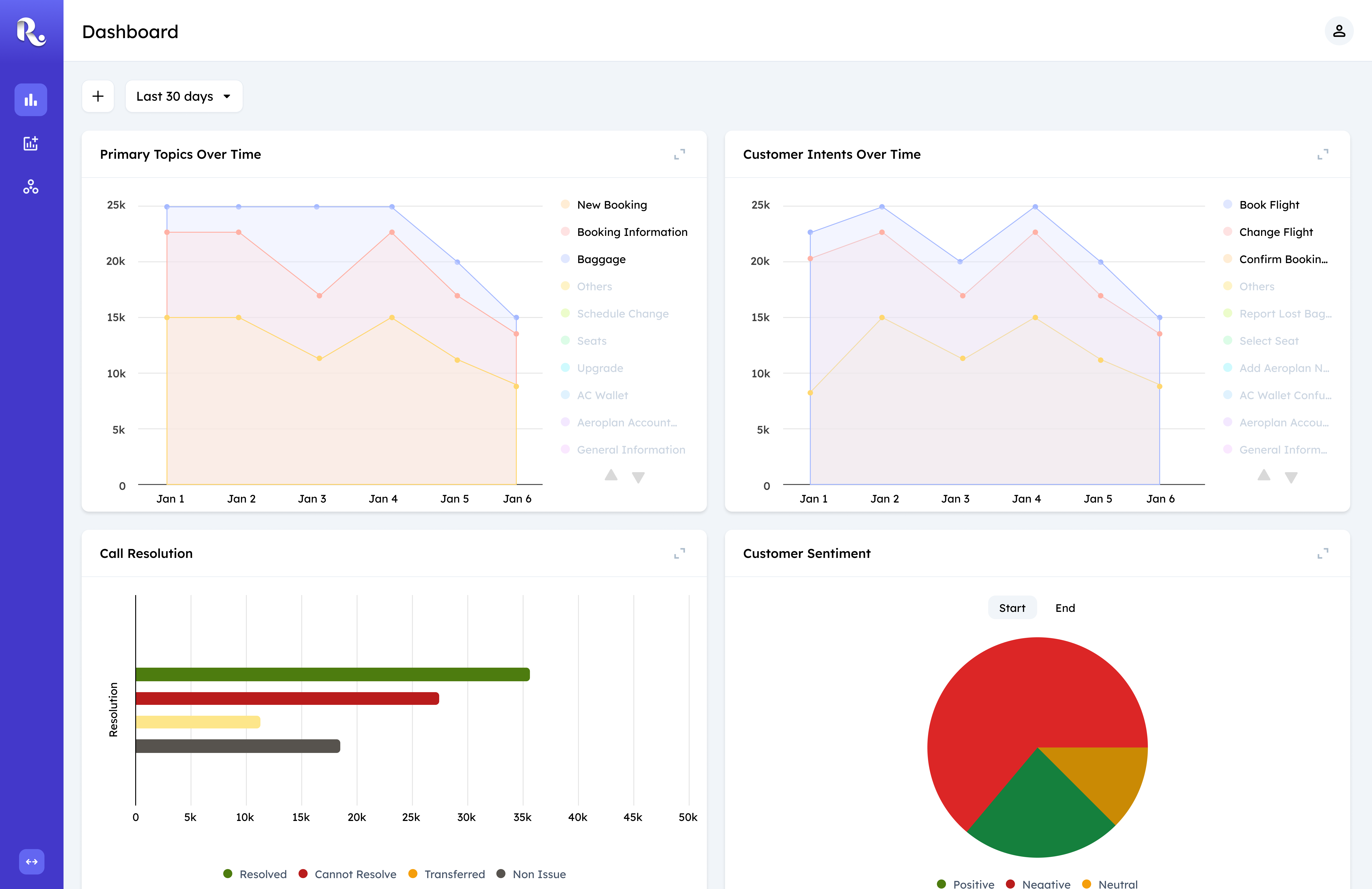
Visualisation for Insights

I anchored the experience around charts because teams needed to spot patterns before deciding what to investigate. I prioritized the metrics stakeholders already used to identify issues, such as changes in topic frequency and sentiment.

Early design showing visualization charts for conversation insights
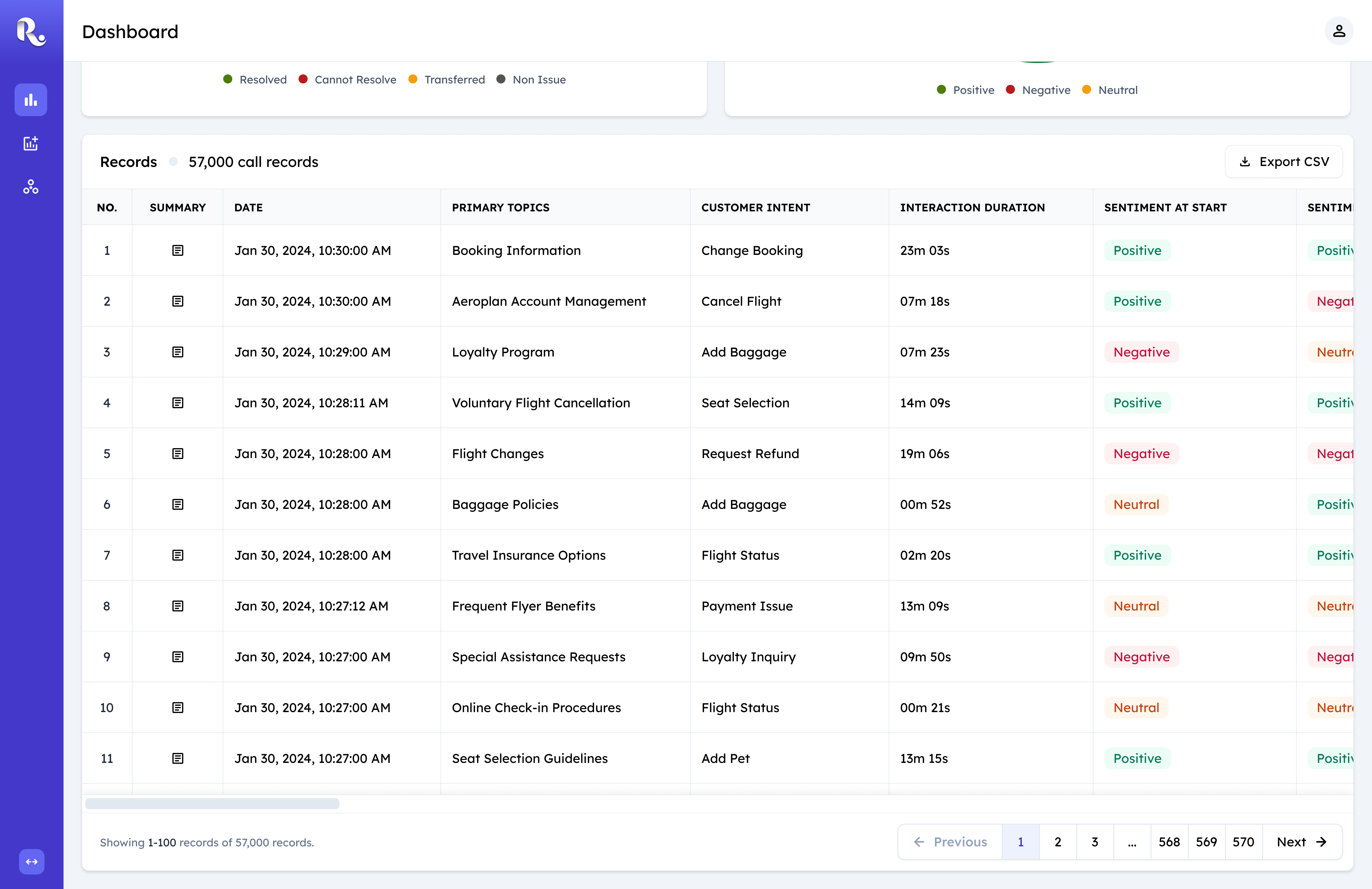
Data Table Operational Metadata

I placed operational data below the insights so teams could move from identifying an issue to tracing it back to specific queues, routing profiles, and agents. This created a direct path from insight to investigation.

Early design showing the operational metadata data table below charts
Column and Date Filters

I made date and column filters shared across the charts and table because scoping was the first step in every investigation. This let teams establish their context once and carry it across both information layers.

Early design showing shared column and date filters for charts and table

The deeper constraint I was designing against: AI-derived signals and operational metadata had previously lived in separate places, forcing teams to piece together a picture across reports and systems. Combining both layers in a single scrollable view was the core structural decision, not a layout preference, but a direct response to where the workflow broke down.

Evolving designs based on user feedback and constraints

After releasing the first version of the product, we conducted weekly feedback calls with our users to identify points of friction and additional requirements. Here's a list of all the problems from multiple user test sessions.
Users preferred direct answers

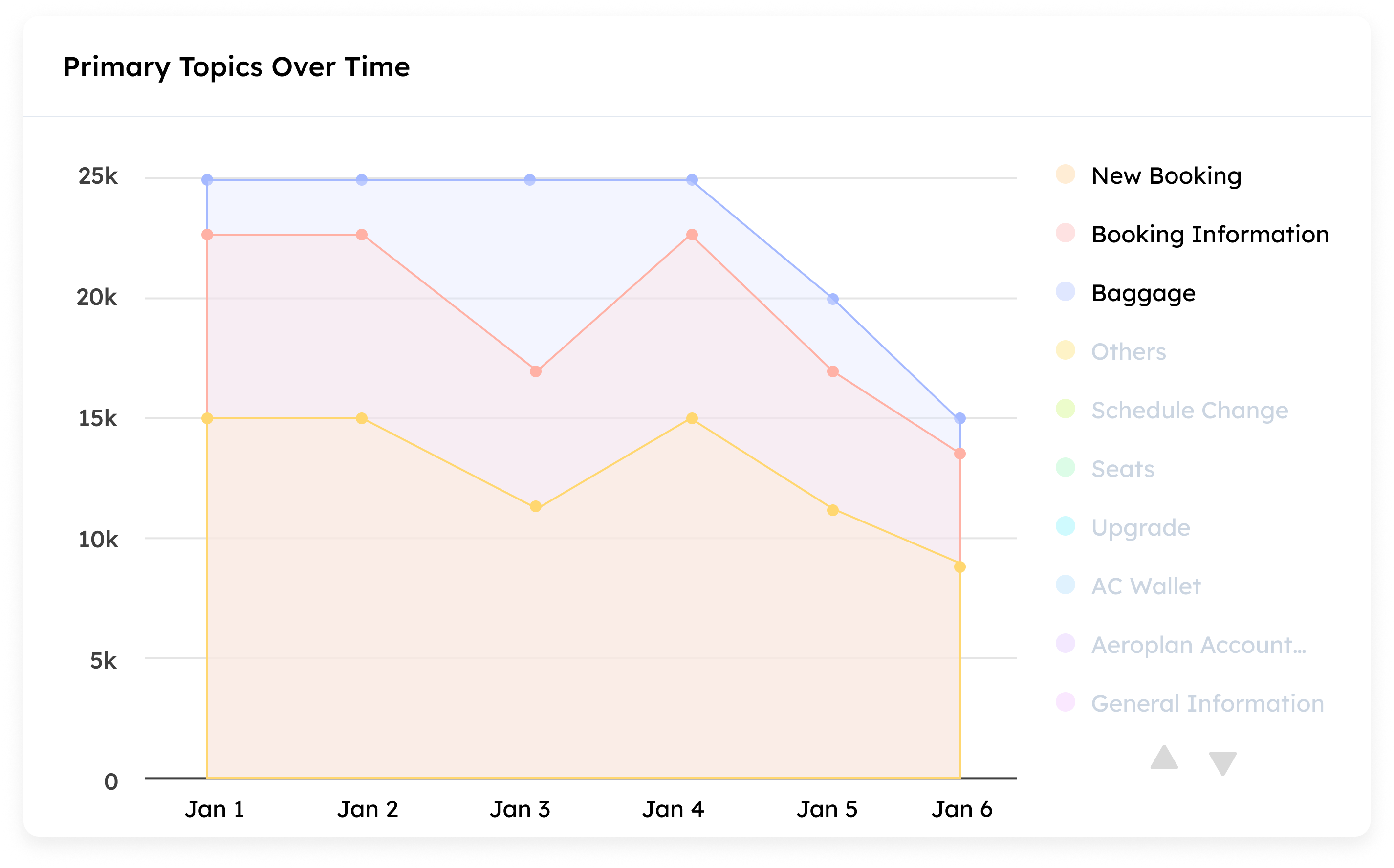
Over a few weeks of feedback calls, I noticed teams consistently bypassed the interactive charts and went straight to conversation records. When I looked closer at what they actually wanted, it wasn't complex: for a topic like "Bookings," they just wanted to see the label and its call count, like 1,345 calls. That was the insight. They didn't need to hover across a trend line or compare it against other topics to get there.

The chart I designed assumed users wanted to explore how an issue moved over time: is this topic trending up, how does it compare to others this week. But for a lot of what teams needed first, the question wasn't "how is this trending," it was "what are the biggest issues right now, and how many calls does each represent." I'd designed for exploration when what was needed, at least as a starting point, was a direct, scannable summary.

Early chart visualization that users bypassed in favor of direct conversation records
Filtering didn't scale with complex investigations.

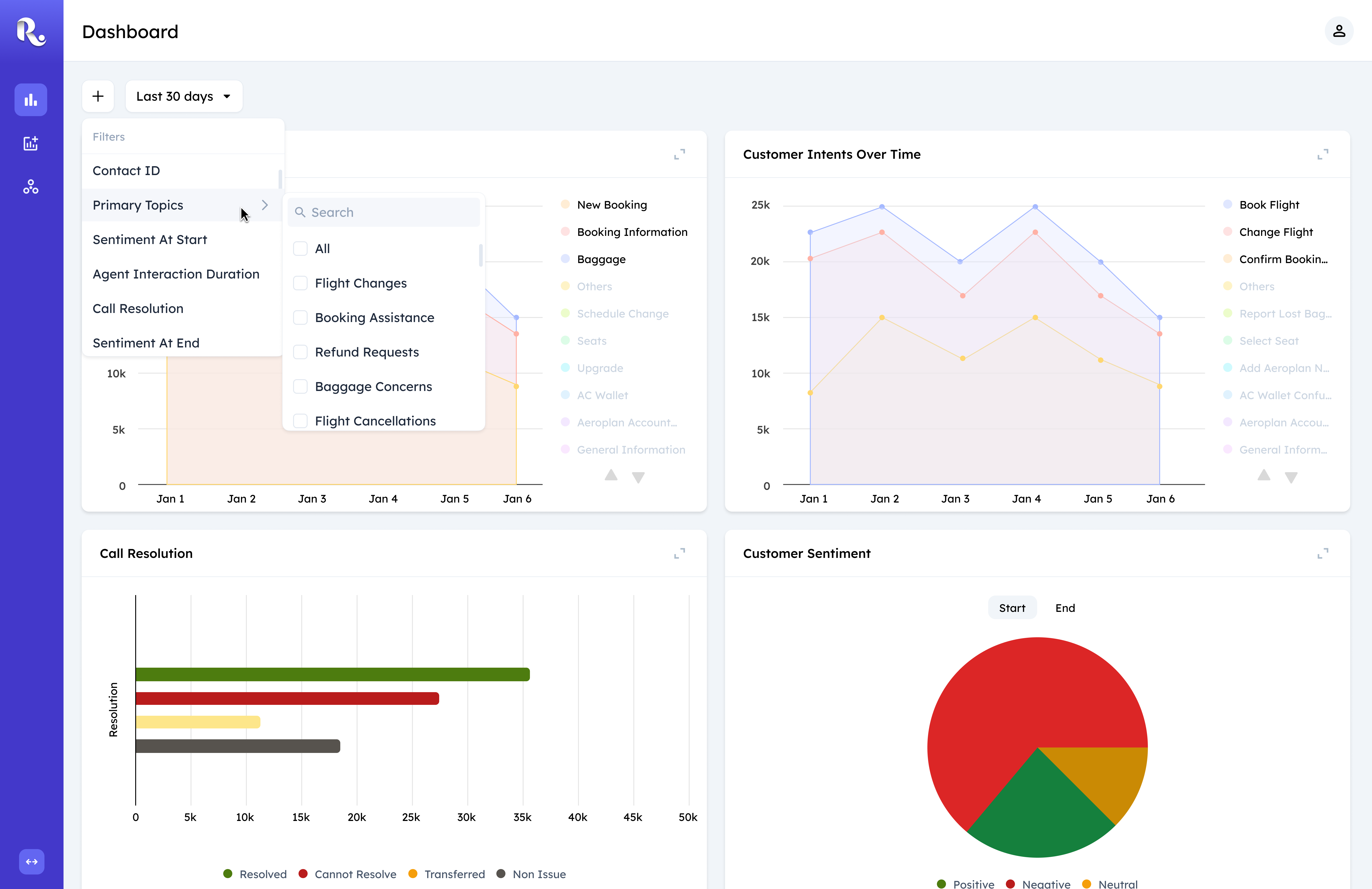
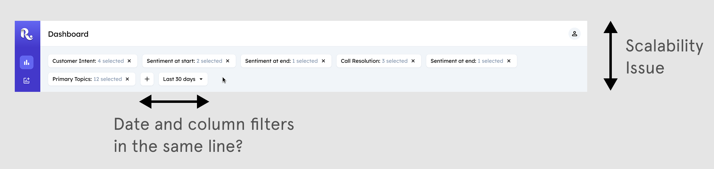
The filter pattern we reused to hit the initial launch, built originally for a product with simpler filtering needs, started breaking down as investigations grew more complex. During the bi-weekly calls, I watched users apply several filters, then struggle to relocate a specific one they'd already set among the chips stacked across the toolbar. Each chip showed only a count ("Primary Topics: 12 selected"), so once five or six were applied, users had to open chips one by one to find the one they actually wanted to check or adjust.

The deeper issue wasn't just the pattern itself; it was what the pattern was doing to the page. Filters had grown to occupy as much visual space as the data they were meant to scope. That inverted the priority of the dashboard: filters are an affordance to control what data is visible, not the content users came to see. Once filtering started competing with the charts and table for attention, the product was asking users to work through the tool before they could get to the information.

Early filter toolbar with stacked chips that became hard to manage during complex investigations
A gap in discovery, not a cut made under pressure.

Another gap that surfaced during feedback calls was that teams relied on operational metrics, like call volume and resolution rate, to decide whether an issue needed attention in the first place. This wasn't something I'd cut for time; it was something my discovery interviews hadn't surfaced. My original interviews focused on how teams moved through an investigation once they'd identified an issue worth digging into. What I hadn't fully asked was: how do you decide something is worth investigating at all? That earlier decision point turned out to depend heavily on these operational numbers, and it was a blind spot in my initial research scope rather than a deliberate tradeoff.

Introducing a Dashboard with Complementary Modes:

Over a couple of development sprints, I iteratively refined the product experience based on the observations made in the user test sessions.

I redesigned Conversation Insights around the way teams actually investigated issues. The first version put everything on one scrolling page, but user sessions showed that the workflow had a natural split: Overview helped teams decide what needed attention, while Table View helped them investigate why. I turned that split into two complementary modes.
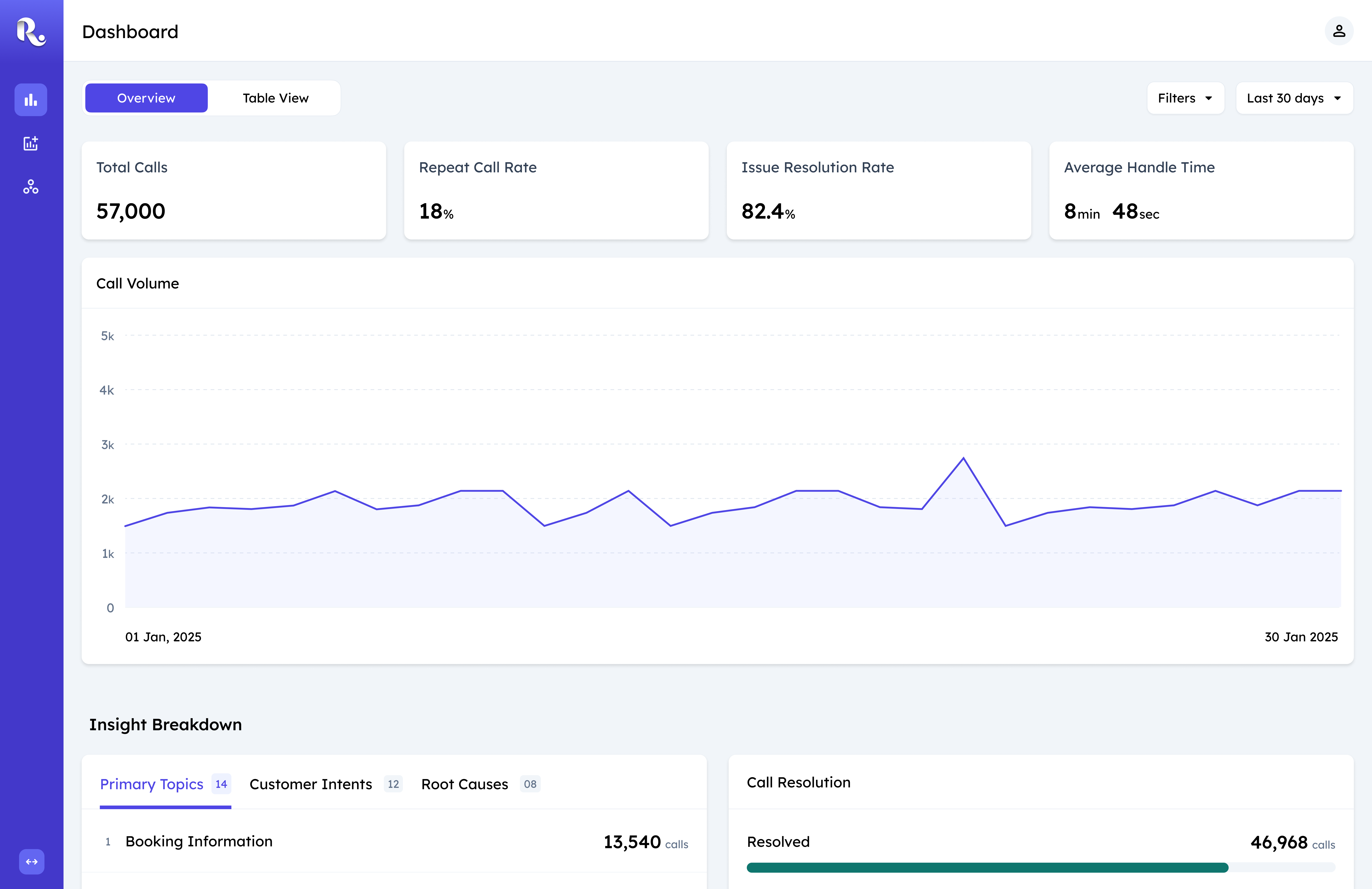
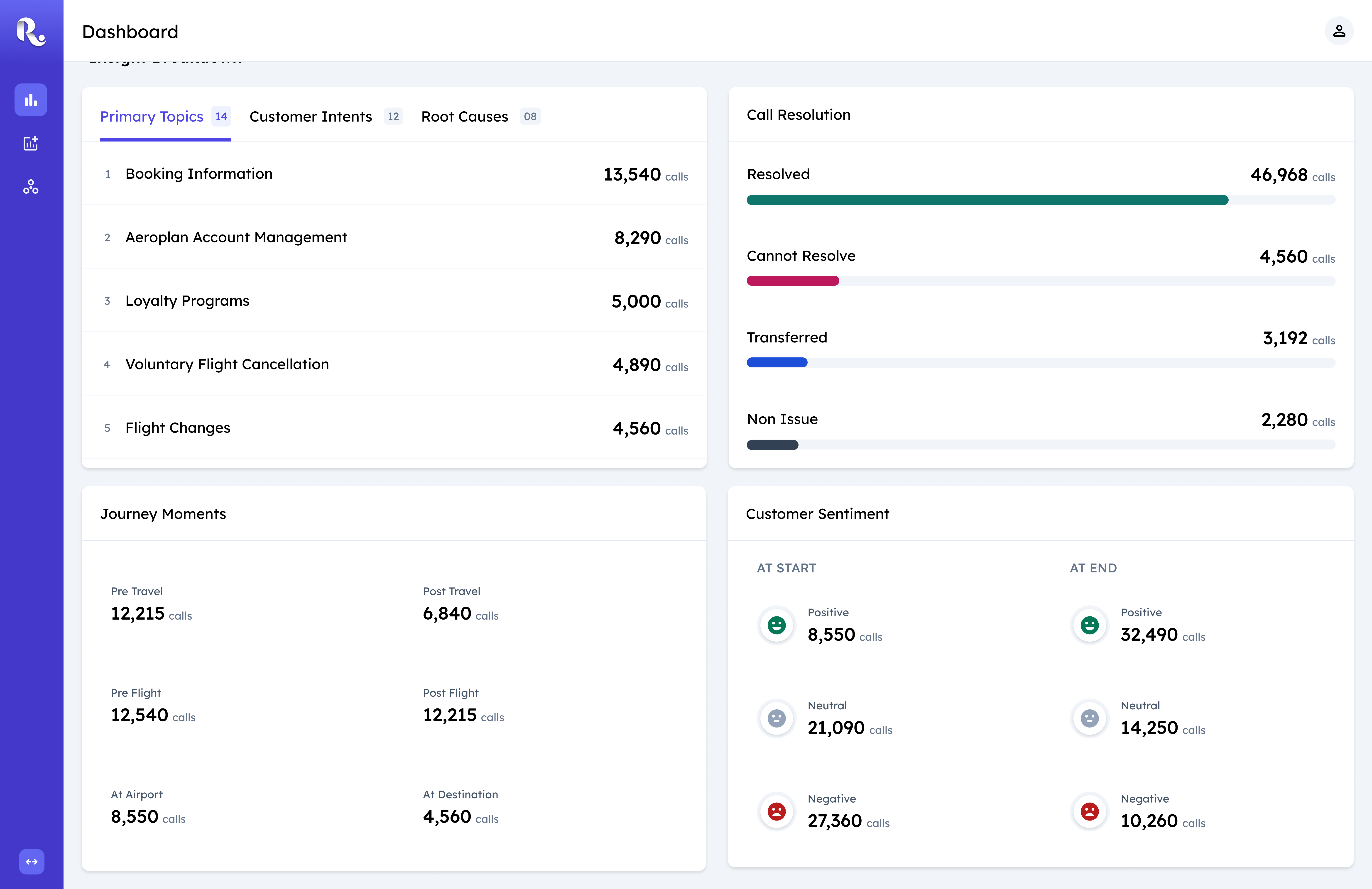
Overview

I designed Overview as the starting point for investigation. It surfaces operational metrics and scannable insight cards so teams can quickly identify where attention is needed before digging deeper.

Overview mode with operational metrics and insight cards
Insight Cards

I replaced the trend-line chart with insight cards because teams wanted to know which issues mattered right now, not just how they changed over time. Instead of forcing every issue into one template, I designed each card around the question it needed to answer.

Insight cards showing distinct comparisons for each issue type
Table View

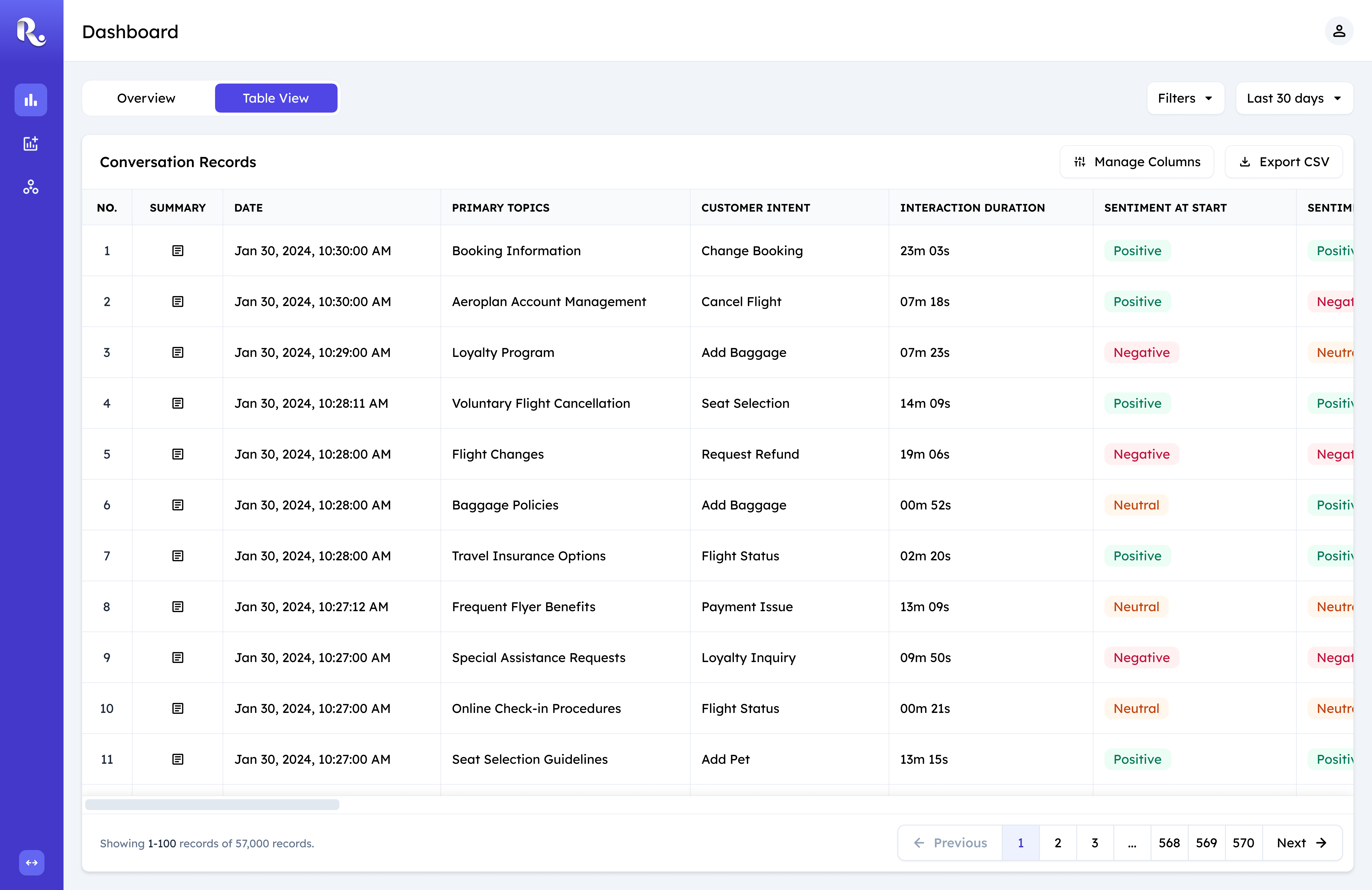
I designed Table View for the deeper investigation. It connects insights to individual calls and exposes the operational attributes teams needed to trace issues across queues, routing paths, and agents.

Table view showing conversation records with operational attributes
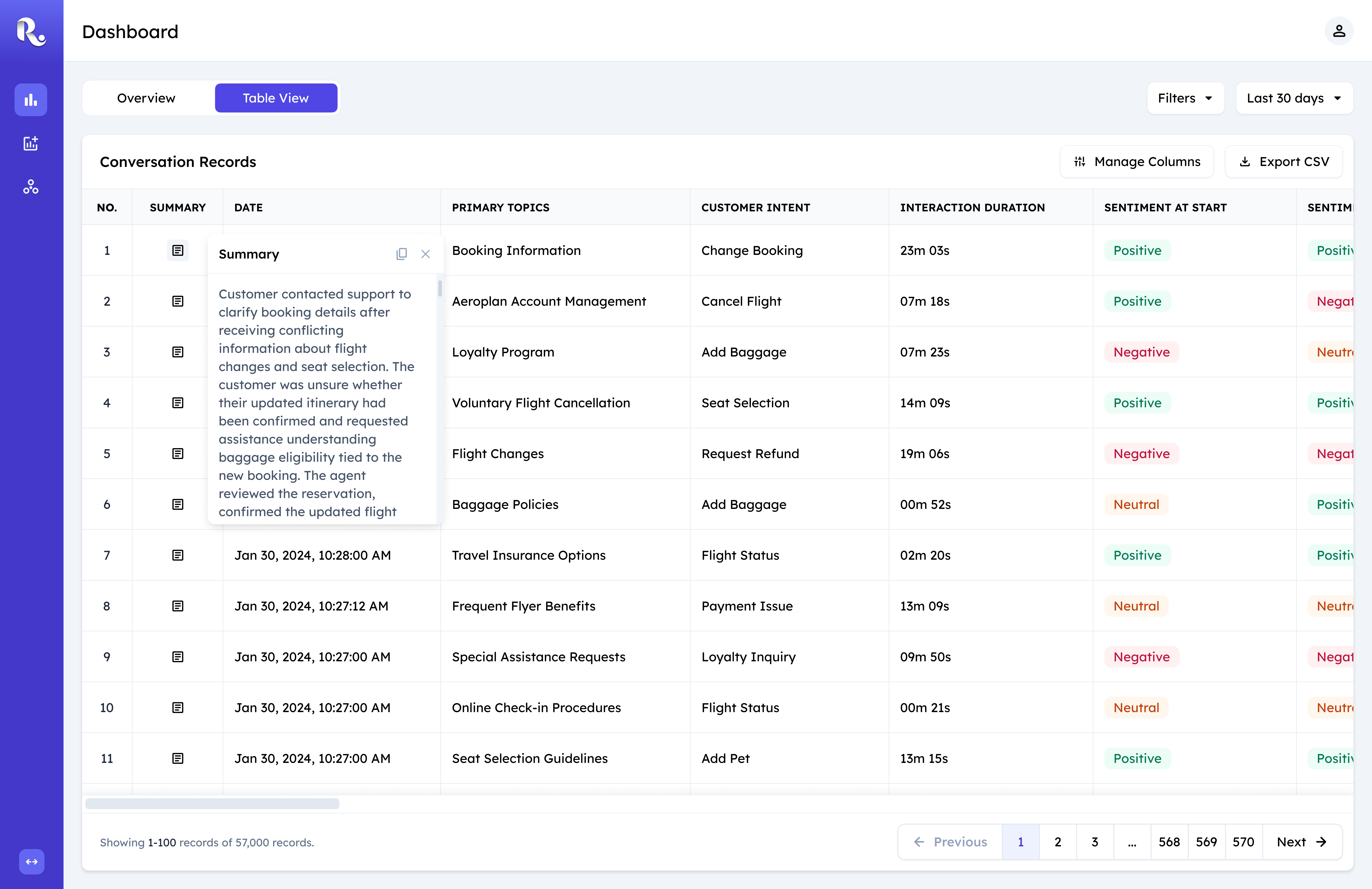
Table view illustrating horizontal scroll friction with many columns
Manage Columns

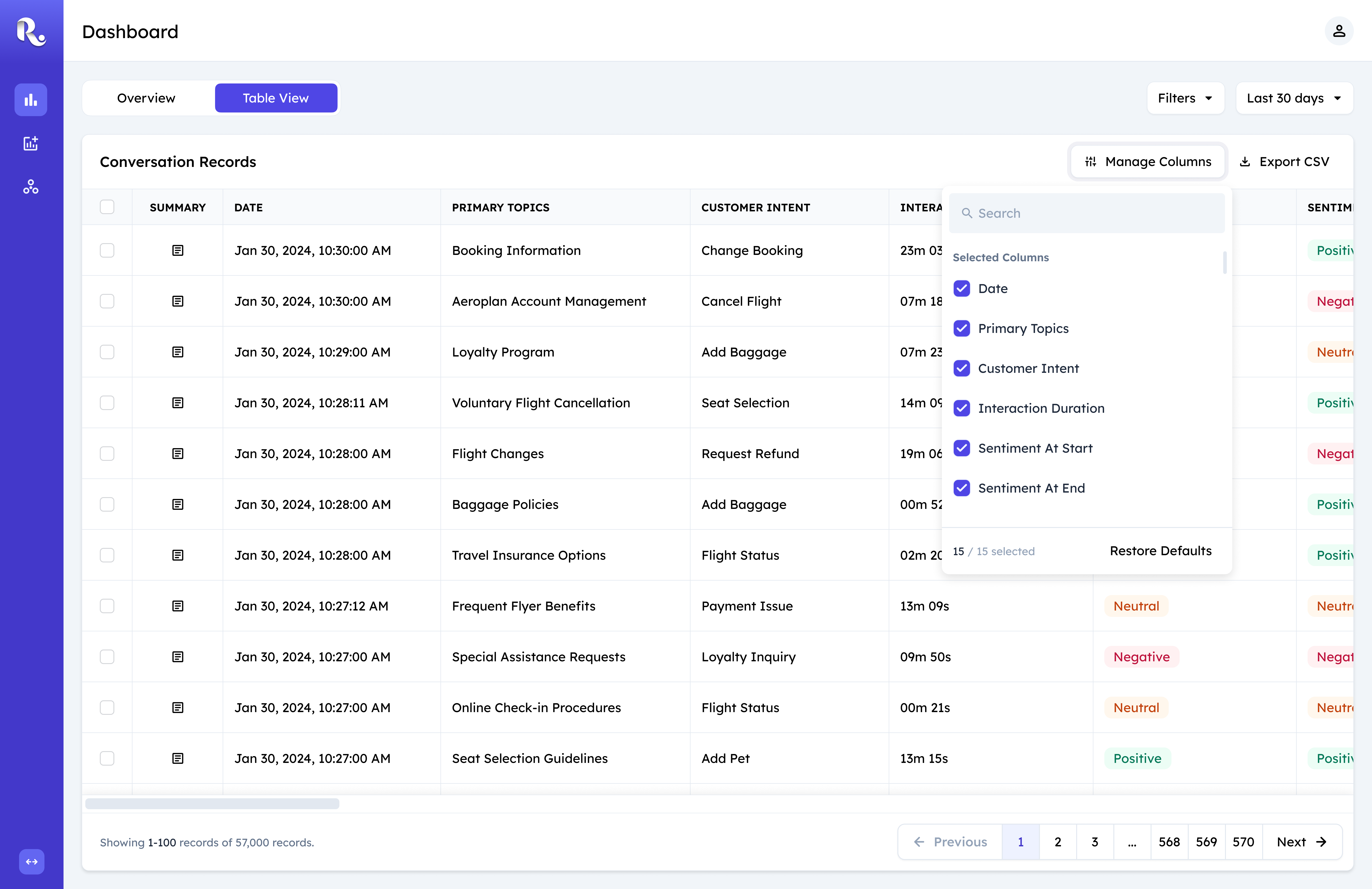
With 60+ attributes, a fixed table made users scroll through information they didn't need. I introduced Manage Columns so each team could bring the attributes relevant to its investigation into view.

Manage Columns panel for customizing visible table attributes
New Filter Pattern

I replaced the reused chip pattern with a query-based filter because investigations rarely relied on a single condition. The new pattern let teams layer conditions across customer and operational data while keeping filters shared between Overview and Table View.

Beyond design...

After shipping all the changes, we noticed significant usage within the product and the product stickiness grew as part of our users everyday workflow. Here's a few outcomes from this project.

Business tie-in

Sustained internal use and external interest supported a renewed client contract and generated new feature requests (under NDA), reinforcing the platform's long-term value beyond the initial engagement.

How this project changed the way I design

Mindset: Utility over polish

Designing for power users changed how I think about “better” design. Conversation Insights served only 20–25 users, but they were power users who cared less about delight and more about having the right information and affordances to do their jobs. Throughout the project, I often saw opportunities to make the interface dramatically more polished, but I learned that improving the interface isn't automatically improving the product. In this context, the best design was often the one that gave users exactly what they needed, without adding anything they didn't.

Tradeoffs: Designing with speed

I learned to design with business momentum, not against it. Conversation Insights had to move quickly, and development had already started before I could fully shape the experience. That was uncomfortable at first, but I learned that a rigid design process isn't always the right response to a fast-moving business. My role was to keep the product moving while creating enough space to observe, reason, and improve the experience as we went. Speed didn't mean abandoning design; it meant being more deliberate about where design effort mattered most.

Collaboration: Engineering as part of design loop

I learned to bring engineering into the design loop early. The insight cards were a custom interaction, and I knew they would require engineering work beyond the existing component system. By keeping engineering involved early and sharing the direction before the design was finalized, I could surface technical constraints sooner and give the team time to plan for what needed to be built. The result was less handoff and more shared ownership of the experience.